batticaloa lighthouse

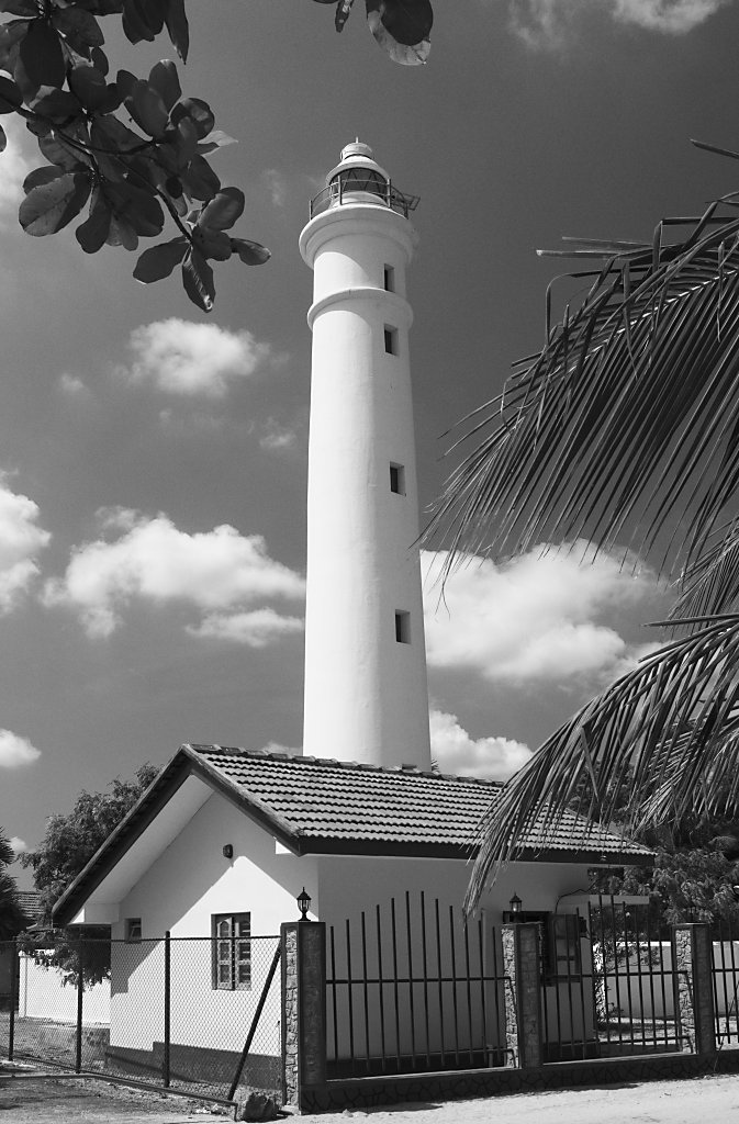
less words this time. punctum – i have decided to get barthes’ book to understand better what he tries to express. above you have the black and white version of the batticaloa lighthouse picture. in my eyes it has a more detached quality than the color version here which is just so …natural and vivid. maybe it’s my mood that i savour more in the black and white version. .

Comments

3 Antworten zu „batticaloa lighthouse“

  1. Love the BW conversion here. Great postcard kind image. I really enjoyed it! 🙂

  2. Incredible capture and the greyscale leaves the eye to explore the details.

  3. Markus Spring

    @ilan: that „postcard kind“ is the inherent irony: After more than 25 years of civil war there is nobody any more who would go there as a tourist…

Schreibe einen Kommentar

Deine E-Mail-Adresse wird nicht veröffentlicht. Erforderliche Felder sind mit * markiert