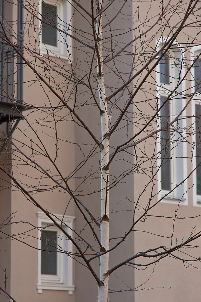
Today was the first really warm spring day with temperatures above 20° C (68° F) which means an explosive developement of the vegetation – my nose feels this earlier than it becomes visible. Anyhow, the soft light around sunset was inviting enough for a walk, where this tree saw me, maybe 150m from home.
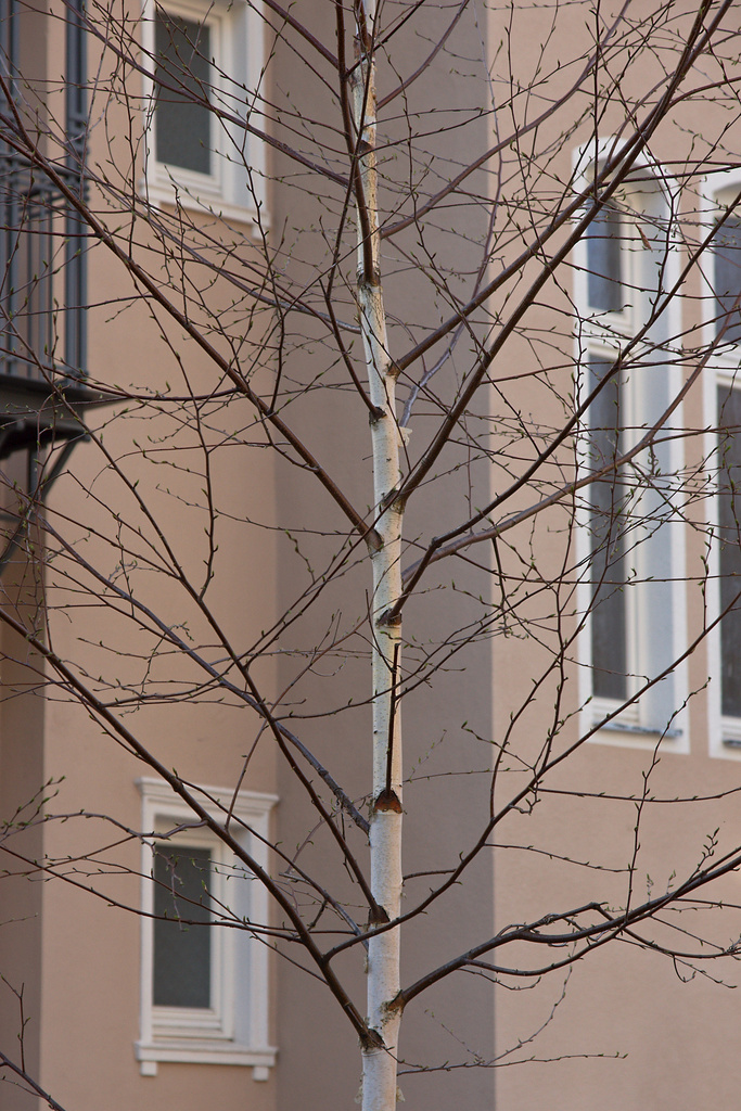
It may serve also as an illustration for a topic that was recently discussed on the Landscapist’s blog: the question of color accuracy. The software I use for raw conversion, bibble5, offers several basic color characteristics, on which one can base the treatment of each image. For me the ‚product reduced‘ way is in most cases the profile to start with, while the ‚product‘ profile (to the right) starts with a clearly higher saturation, but still within the correct range, according to my memory.
Much more than the question of accuracy I ask the question of purpose. In this image, the subtle grace, the fine patterns and textures of the bark on the stem, all get supported by choosing the variant with the lower saturation. It could well be that the color in the sample to the right is more correct, for example I did not pay attention to the color of the junctions between stem and branches, but from my gut’s feeling, the impression of the big image comes closer to what resonated within me when making this image. Color accuracy here certainly is of secondary importance.
Schreibe einen Kommentar